How to Choose the Perfect Brown Paper Color for Your Packaging

Color is very important in packaging. It affects how people see products and influences what they buy. Picking the right shade of brown paper colour can show your brand's identity and attract the audience you want. Recent studies say that brown packaging might seem less valuable than other colors, making your choice of brown paper colour even more important.
Key Takeaways
Know who your audience is. Their age, gender, and income affect what colors they like. Pick a brown paper color that connects with them.
Match your brown paper color to your brand. Choose colors that show your brand's values, like trust and honesty.
Keep your packaging design the same. Use clear rules and check samples to make sure your brown paper color fits your brand on all products.
Target Audience Insights
Knowing your target audience is very important when picking the right brown paper colour for your packaging. Factors like age, gender, and income can change how people see your product.
Demographic Factors
Demographics such as age, gender, and income can affect how people react to packaging colors. Here are some important points:
Age: Younger people usually want to pay more for nice packaging. For example, studies show that age helps increase willingness to pay for all colors, especially organic items.
Gender: Gender can change preferences. Research shows that women like white and blue packaging but may not like green-labeled products as much.
Income Level: People with higher incomes might pay more for fancy packaging. But this effect is limited and changes with different products.
Color Preferences
Color preferences can be very different among various groups. Here’s a table that shows how different colors make people feel:
Color | Associated Emotions/Values |
|---|---|
Red | Excitement, boldness, youthfulness, passion, warmth |
Orange | Friendliness, cheerfulness, confidence, creativity |
Yellow | Cheerfulness, clarity, warmth, optimism |
Green | Soothing, freshness, eco-friendliness, harmony |
Blue | Calmness, trustworthiness, efficiency, dependability |
Purple | Indulgence, luxury, spirituality, exclusivity |
Pink | Femininity, calmness, playfulness, love |
Black | Elegance, sophistication, authority |
White | Simplicity, purity, cleanliness |
Grey | Calmness, neutrality, balance |
Also, cultural differences can change color preferences. For example, in North America and Europe, people often like simple and soft colors that show sophistication. In contrast, Eastern cultures, like Japan, prefer bright and detailed colors that highlight beauty and meaning.
Japanese people often like lighter pastel colors.
Americans usually like stronger colors, showing a cultural difference in color taste.
Knowing these demographic factors and color preferences can help you choose a brown paper colour that connects with your audience. By matching your packaging with their likes, you make your brand more appealing and increase the chances of a purchase.
Brand Identity Alignment
Choosing the right brown paper colour is very important for showing your brand values. The color you pick should express what your brand means. Here are some key points to think about:
Brand Values Reflection
Brown is often linked to reliability, earthiness, and authenticity. These traits connect with customers who care about trust and sustainability. For example, UPS uses brown well to show these values. Their slogan, "What can brown do for you?" shows how color choice can shape brand identity.
Think about these connections with brown:
Negative Associations | |
|---|---|
Seriousness | Humorlessness |
Warmth | Heaviness |
Earthiness | Lack of sophistication |
Reliability | Sadness |
Support | Dirtiness |
Authenticity | Conservativeness |
Using brown paper colour in your packaging can help show these good connections. It creates warmth and reliability that can draw in your target audience.
Consistency in Design
Keeping your packaging design consistent is very important. You want your brown paper colour to match your brand identity across all products. Here are some best practices to keep things consistent:
Talk about color early: Start talking about color during the design stage. Don’t wait until the artwork is done.
Be clear about your standards: Share brand guidelines and color samples to help with production choices.
Request samples and proofs: Physical or digital proofs help check color accuracy before full production starts.
Know what to look for: Color can look different based on lighting and materials. Work with your packaging partner to understand how your color should look.
Check for quality at each step: Review samples and talk with your packaging supplier to catch problems before they reach customers.
Work with an experienced packaging partner: A supplier with color management skills can help keep consistency across formats and product lines.
By following these steps, you can make sure your brown paper colour stays consistent and supports your brand identity. This consistency builds trust with customers and improves how they see your brand.
Competitor Analysis
Looking at what your competitors do can help you pick the best brown paper colour for your packaging. Knowing market trends and how to be different can help you get noticed.
Market Trends
Watch what is happening in the market today. Many brands are moving to eco-friendly packaging. Brown paper colour often stands for being good for the environment and being simple. Here are some trends to think about:
Sustainability: More brands are using recycled materials. Brown paper colour fits this trend because it shows a natural and organic style.
Minimalism: Simple designs with brown paper colour attract people who like clean looks. This trend focuses on less mess and more attention on the product.
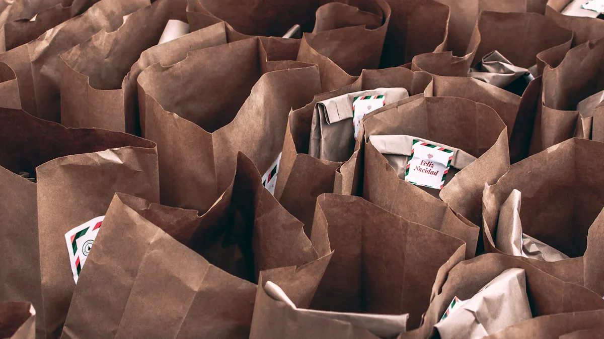
Vintage Appeal: Feelings of nostalgia affect what people buy. Many brands use brown paper colour to bring back a sense of tradition and realness.
Differentiation Techniques
To be different, you need to make your packaging stand out from others. Here are some ideas to think about:
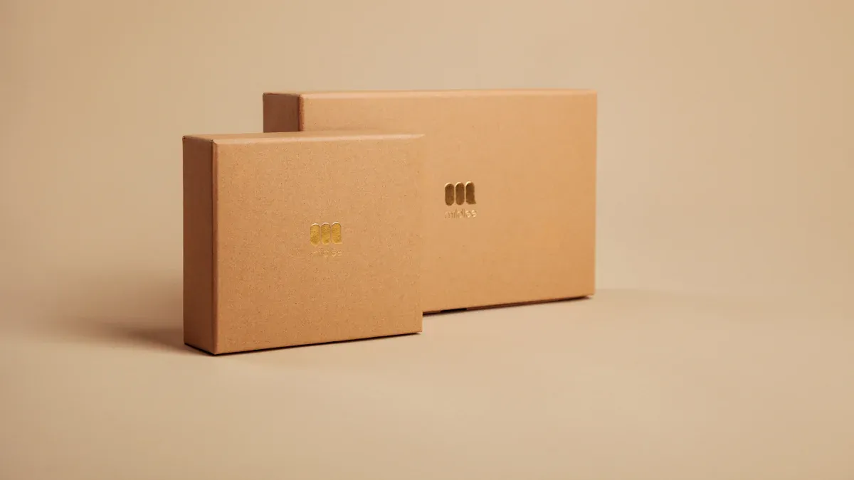
Unique Textures: Try different textures of brown paper. A rough feel can give a rustic vibe, while a smooth feel can show elegance.
Custom Prints: Add custom prints on your brown paper colour. This can be logos, patterns, or messages that connect with your audience.
Innovative Shapes: Think about unique shapes for your packaging. A special box or bag can make your product memorable, even with simple brown paper colour.
By looking at these points, you can choose a brown paper colour that shows your brand and helps you stand out in the market.
Psychological Impact of Color

Color is very important in how people see products. When you pick a brown paper colour for your packaging, you affect how your audience feels and thinks. Knowing these psychological effects can help you make smarter choices.
Emotional Responses
Different shades of brown can create different feelings. Here are some common feelings linked to brown:
Nurturing: Brown often feels warm and cozy, making people feel cared for.
Earthiness: This color connects people to nature and gives a sense of stability.
Strength: Brown shows reliability and toughness, which can build trust in your product.
Comfort: Many see brown as a calming color, creating a sense of ease.
Maturity: Brown suggests sophistication and maturity, appealing to more thoughtful buyers.
Reliability: This color is often seen as dependable, making it a good choice for brands that want to gain trust.
But if you don’t design well, brown can seem dull. It’s important to mix brown with other design elements to keep your packaging interesting.
Cultural Associations
How people see brown can change a lot in different places. Here’s a table that shows important cultural views of brown paper colour in major global areas:
Region | Cultural Association |
|---|---|
U.S. | Earthy, stable, dependable; used in food containers and by delivery companies like UPS. |
Middle East | Comfortable color, harmonious with the earth. |
Latin America | Can be met with disapproval in countries like Colombia and Nicaragua. |
Eastern countries | Associated with mourning, particularly in India. |
In the U.S., brown is often seen as a trustworthy color. It is commonly used in food packaging and by companies like UPS, which strengthens its link to reliability. However, in some Latin American countries, brown might not be liked, while in Eastern cultures, it can mean mourning. Knowing these cultural differences can help you choose a brown paper colour that your audience will like.
By thinking about both feelings and cultural views, you can pick a brown paper colour that shows your brand identity and connects with consumers more deeply.
Choosing the Right Brown Paper Colour
Strength and Durability
When you pick a brown paper colour for your packaging, think about its strength and durability. Kraft paper is known for being very strong. It can hold heavy items without ripping. This makes it a great choice for shipping and packaging.
Property | Description |
|---|---|
Strength | Kraft paper is very strong, so it works well for heavy items. |
Durability | Its strong nature helps packages stay safe during shipping. |
Another important feature of kraft paper is its high tensile strength. It can take a lot of stress, which lowers the chance of damage while shipping. This quality is key for keeping your products safe.
Visual Appeal
The look of your packaging is very important for attracting customers. Here are some design ideas to make brown paper packaging more appealing:
Maximize Texture: Use textures that feel natural. This makes your packaging more interesting and engages all senses.
Consider Sleek Lines: Add smooth lines to show elegance and modern style. This can attract luxury buyers.
Go Green: Highlight eco-friendliness in your packaging design. More consumers want options that are good for the environment.
By focusing on these points, you can choose a brown paper colour that works well and also grabs your audience's attention.
Picking the best brown paper color for your packaging is very important. Think about these main ideas:
Customer Convenience: Keep food safe while shipping.
Brand Image: Show professionalism and care for details.
Sustainability Goals: Match with eco-friendly values.
Think about your brand and audience. The right color can really affect your business success. 🌟
FAQ
What is the best shade of brown for packaging?
The best shade of brown depends on your brand and audience. Try different shades to find what works best.
How does brown paper color affect consumer perception?
Brown paper color usually shows reliability and earthiness. It can attract eco-friendly buyers and build trust in your brand.
Can I mix brown paper with other colors?
Yes! You can mix brown with other colors for a unique look. Just make sure it matches your brand message and appeals to your audience.