White vs Cream Paper: Which One Will Elevate Your Book's Professionalism?

Authors frequently face a dilemma: choosing between white vs cream paper. There isn't a universally superior option; the best choice hinges on the book's genre and its internal content. Cream paper often conveys a more professional aesthetic, particularly for text-heavy books like novels. It offers a classic, sophisticated feel and is generally easier on the eyes for extended reading. Conversely, white paper projects a modern and crisp image. It's the preferred choice for books containing technical information or numerous illustrations. This guide aims to assist authors in navigating the white vs cream paper decision, enabling them to select the ideal paper that enhances their book's visual appeal and perceived quality.
Key Takeaways
Cream paper makes novels and text-heavy books look professional. It is easier on the eyes for long reading.
White paper is good for books with many pictures or technical information. It makes images and text look clear.
Cream paper helps reduce eye strain. It has less glare than white paper.
White paper makes colors in pictures look true. It is best for books that need exact images.
The choice between white and cream paper depends on your book's type. Consider your book's content and audience.
Cream Paper's Professional Appeal
Cream paper helps authors. It makes their books look more professional. This paper choice fits old publishing rules. It also meets what readers expect.
Traditional Aesthetic
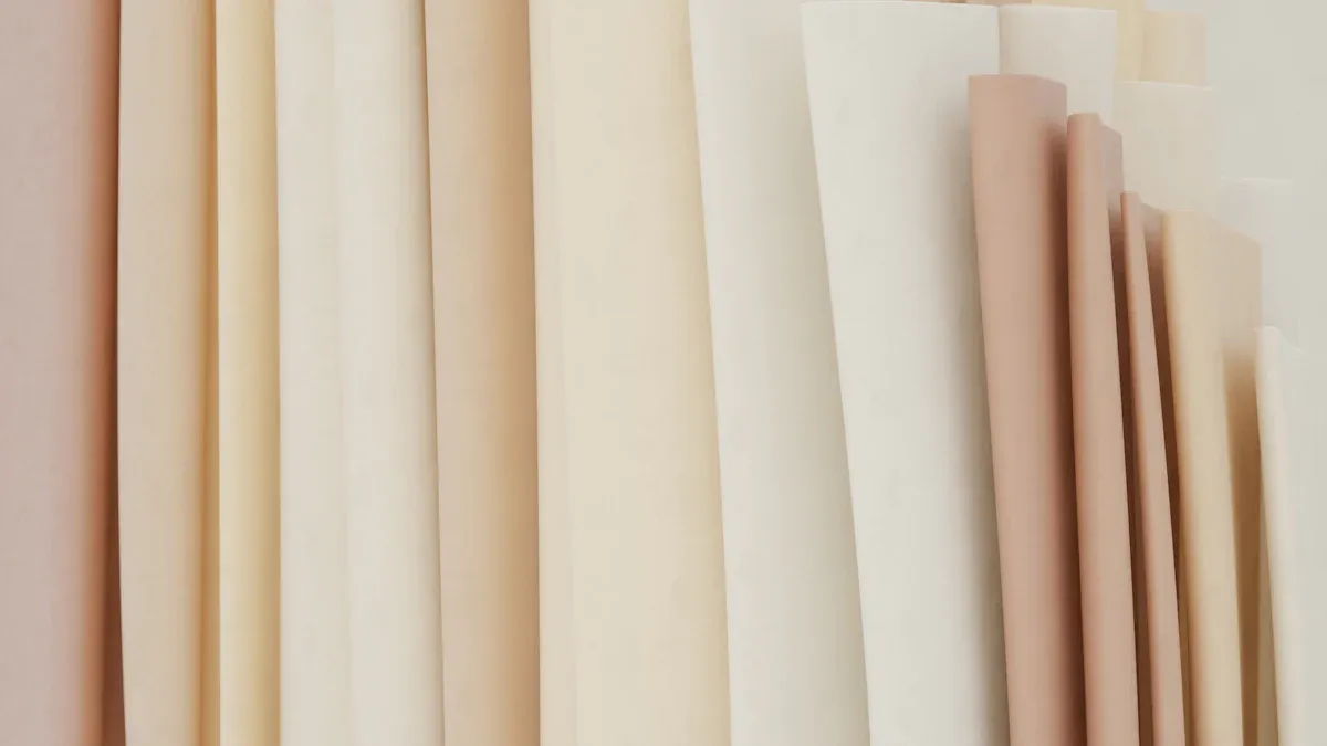
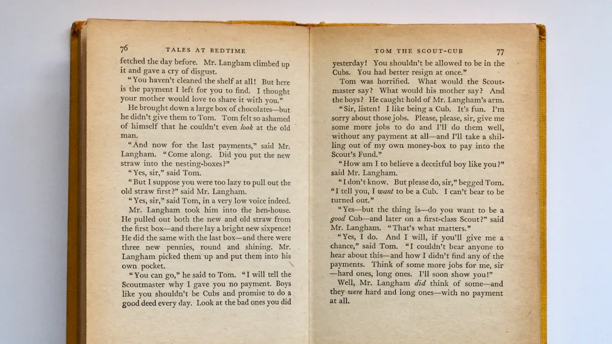
Cream paper looks warm and classic. It feels like an old, loved book. Or it feels like a fancy invitation. Publishers often pick cream paper. Readers think it looks professional. This choice follows old publishing ways. White paper can look cheap. It can look like a school book. Many readers want cream paper for stories. They think white paper is for self-published books. Or for books that are not as good. This shows paper color is important. It affects how a book looks. Choosing cream paper shows care. Readers often like this care.
Reader Comfort
Cream paper helps readers a lot. It is a big benefit. Its warm color reduces glare. Bright white paper has more glare. This makes long reading times nicer. Studies show cream paper helps. It lessens discomfort. It also lessens tiredness. This is true for long reading. It can help stop eye strain. Cream paper has less contrast. This helps people with ADHD. It stops things from distracting them. It helps them focus better. Some people have trouble seeing. Or they see things strangely. Cream paper's warm color helps them read better. For example, someone had keratoconus. They saw double images. Reading black print on cream paper helped a lot. This shows cream paper can make reading easier for many.
Ideal Genres
Cream paper works well for some book types. Most novels use cream-colored paper. Writers of novels often hear this advice. They should pick cream paper for their books. Books with only text also do well. They should be printed on cream paper. This paper is softer. It is a more comfortable background. This is good for long reading. It reduces eye strain. This is key for books with lots of text. Cream paper is also usually thicker. It is also less see-through. This stops text from showing through. This makes a better final product. It looks professional. It makes reading more fun. It also makes the book look good. And it makes it last longer.
Printing Considerations
Authors should know about cream paper. They should know how it works. Cream paper can make a short book look bigger. This is true for books under 300 pages. This can be good. An author might want their book to feel bigger. The paper is not see-through. This stops ink from showing. This makes a cleaner document. It looks more professional. Printing on cream paper can add class. It adds a classic style. This makes books look fancy. They look like high-quality books. The paper color is very important. It changes how readers see the book's quality.
White Paper's Professional Edge
White paper has many good points. It works for modern books. It makes things look clear. It makes pictures pop.
Modernity and Clarity
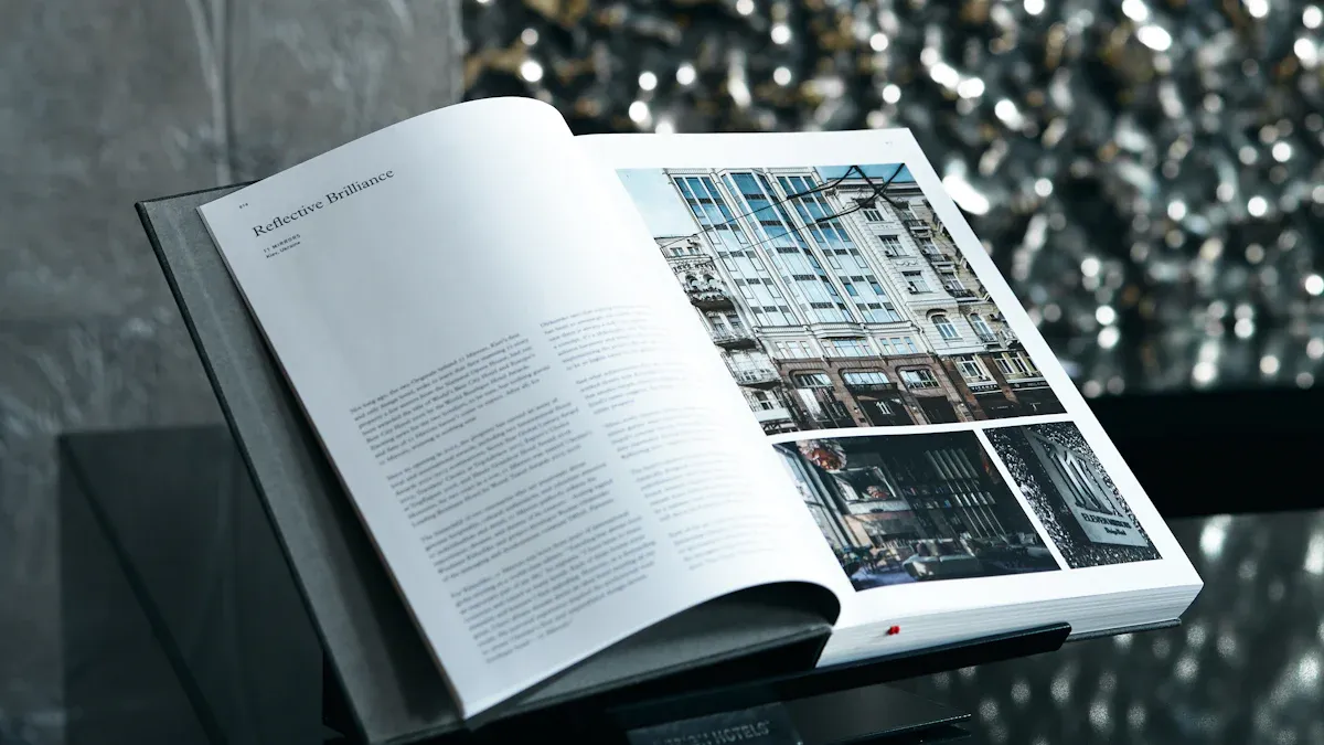
White paper is clean and bright. Text and pictures stand out. It makes a book feel new. Many people think white paper means new ideas. It means clear talks. Black words on white paper are easy to read. This helps explain hard ideas. A book on white paper looks fresh. It looks current. This makes it look professional.
Best Use Cases
White paper is great for some books. Textbooks use it well. Guides use it too. Technical books use white paper. Reports and journals also use it. These books have lots of facts. They need clear words and pictures. Cookbooks and art books use white paper. Photo books also use it. The bright paper shows true colors. White paper is best for exact pictures.
Visuals and Technical Content
White paper makes pictures clear. It makes them strong. It is best for images. It is best for diagrams. Authors can add tables. They can add boxes. These show main points. These make facts easy to read. Using whole pages for pictures helps. It gets the message across. This makes a strong visual.
Lots of empty space helps pages. It stops clutter. It lets text and pictures breathe. This makes reading much easier. For example, Google Cloud uses clear pictures. It uses simple words. This breaks down hard ideas. It is strong and clear. Frost & Sullivan also uses many pictures. Their paper for Samsung has charts. It has case facts. These help ideas. They do not distract. This makes content easy to use.
White paper shows colors well. This is for pictures.
Feature | Colored Paper | White Paper |
|---|---|---|
Color Reproduction | Less accurate | Optimal accuracy |
Image Quality | Can alter photo colors | True-to-life colors |
White paper is best for good pictures. It is best for clear pictures. It has no color itself. This makes pictures exact. It makes colors true. This is key for catalogs. It is key for art books. It is key for ads. These use many photos.
Printing and Ink
Printing on white paper looks great. Ink colors are bright. Details are clear. Many things help this. Good inks have steady color. This makes colors right. It stops muddy colors. It stops color changes. Printers must be set right. This puts ink on well. Using the right ICC profile is key. This matches screen colors. It matches printer colors.
Paper choice is also important. Papers soak up light differently. They reflect light differently. This changes how colors look. Coated papers soak up less ink. Ink stays on top. This makes pictures sharper. Colors are brighter. Papers that soak up a lot dull colors. Whiter paper is a neutral base. This makes colors look brighter. It makes them more exact. Special coatings on photo papers help. They work with certain inks. This makes colors shine. It makes them sharp.
Printers use different inks. This is for white paper.
Pigment-based Inks: These inks stay on top. Colors are soft but lasting. They resist water. They resist smudges. They resist UV light. They are good for old prints.
Light Cyan (LC) and Light Magenta (LM): These inks are light. They make colors smooth. They show small details. This is in light areas. It makes less grain. It makes less stripes.
Grey (G) or Light Grey (LG): These inks make grey colors. They make black and white photos better. They stop color tints. They make smooth grey changes.
Photo Black (PK) and Matte Black (MK): Printers use these for different papers. Photo Black is for shiny paper. Matte Black is for dull paper. They make colors dark. They make them sharp. This is on different papers.
Choosing white paper shows care. This is for a professional paper. This paper color makes all pictures look right. It makes the book look better.
White vs Cream Paper: Reader Comfort
Impact on Reading
Paper choice changes how you read. Both white and cream paper are good. They are not too bright. They are not too dull. This stops your eyes from hurting. Cream paper is usually easier to read. Most books use black ink. This is for comfort. It avoids strange fonts. It avoids bright colors.
Reader Comfort Aspects | |
|---|---|
White Paper | Text stands out more. This helps with hard topics. It is good for school books. |
Cream Paper | It looks warm and soft. It is easier to read for a long time. It has less glare. This helps you read more. It feels cozy. It is used for old books and stories. |
Most people like cream paper. It is nice to read. Many storybooks use it. Book lovers feel good about cream paper. Studies on paper color are mixed. Some say color does not change reading. Others say it can help.
Cream for Less Fatigue
Cream paper helps your eyes. It stops them from getting tired. It looks warm and soft. This means less glare. You can read longer. It makes reading easy. It feels cozy. It is good for long books. People think of old books. This paper makes reading fun. You can read for hours.
White for Focus
White paper makes text pop. It is easy to see. This helps with hard topics. It is good for school books. But white paper can hurt some eyes. It can make focusing hard. It can make you tired. You might forget what you read. Black words on white can be hard. It can make reading tough.
Accessibility
Paper color helps people. It helps those with eye problems. White paper can be too bright. It can make reading hard. This is true for people with bad eyesight. It makes eyes tired. It makes focusing hard. Colored paper can help. It makes reading easier. For computers, change the page color. Make it off-white. This helps your eyes. Dark mode also helps. It is good for reading at night. Teachers can help. They can find good paper colors.
Printing and Cost
POD Availability
Authors use print-on-demand. These services have paper choices. BookLogix has 50lb cream paper. It is for black and white books. IngramSpark has "creme" paper. Lulu has 60# Cream paper. This paper is a classic cream. Many authors use it. It is for novels and workbooks.
Offset Printing
Offset printing is another way. It is for many books. Cream paper in offset printing looks good. A fancy brand might use it. It shows style and class. This fits their brand. For white paper, things matter. Opacity stops text show-through. Brightness makes colors pop. Ink must work well. This makes good prints. Weight and thickness mean it lasts. Coated paper is smooth. Uncoated paper feels natural.
Cost Differences
Paper choice changes costs. It also changes production time. Publishers think about the book. They think about readers. A cookbook needs thick paper. This stops ink from bleeding. Better paper costs more. Normal paper costs less. Paper thickness and weight are key. John Edwards says low PPI paper saves shipping costs. This is for many pages. High PPI paper makes short books thick. Coated paper costs the most.
Sustainability
People care about the environment. Many want eco-friendly paper. This means recycled paper. Or FSC-certified paper. Paper choice changes the cost. Weight, feel, coating, and color change the price. Making paper uses much energy. It also makes carbon dioxide. Choosing other options helps. Authors can use recycled paper. They can pick paper without chlorine. These choices help the Earth.
The choice is important. It is between white and cream paper. It makes a book look professional. Cream paper is good for stories. It is good for long text. It feels warm. It is easy to read. White paper is good for facts. It is good for manuals. It is good for pictures. White paper looks sharp. Colors look right. Authors should think about their book type. They should think about who reads it. They should think about pictures. This helps them pick the best paper. It makes their book look great.
FAQ
Which paper is better for novels?
Cream paper is often better. It looks old-fashioned. Readers find it easier to read. This is for long times. It helps eyes not get tired. It makes the book feel warm.
When should authors choose white paper?
Authors should pick white paper. This is for tech books. It is also for books with many pictures. White paper makes things clear. It makes pictures stand out. Colors look right.
Does paper color affect eye strain?
Yes, paper color changes eye strain. Cream paper is easier on eyes. Its warm color stops glare. This makes reading longer easier. White paper can tire eyes more.
Is there a cost difference between white and cream paper?
The cost difference is small. This is for print-on-demand. Other things change the price more. These are paper weight and pages. Offset printing may have small changes.
What paper type makes a short book look bulkier?
Cream paper can make a short book look bigger. This is true for books under 300 pages. It feels a bit thicker. It is also less see-through. Authors use this. It makes short books feel more important.